bergamot
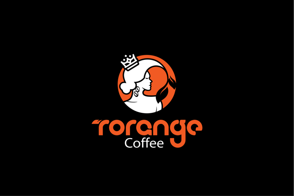
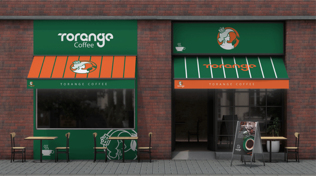
The structure of the logo, taking into account the name of the logo and the subject of its use, which is designed for a coffee shop, consists of a combination of three items: bergamot fruit, coffee beans and a woman’s face. The special focus was on the character design with a combination of crown and leaves and coffee at the original request of the customer, which was also included in the logotype design (the leaf of the bergamot tree).
Due to the simplicity of the natural shapes and especially the circle, the presence of the female character conveys an endless feeling without beginning and end to the audience, and this element adds a concept of freedom to the brand. The personality that is expected from the brand sign is an image of a different and nostalgic woman, which should evoke a reliable and weighty personality for the customer.
The use of green is a reminder of nature and a symbol of growth. The green color in the logo calms the eyes and relieves the stress of the viewer and represents balance, trust, prosperity and prosperity.
The white color in the logo is a reminder of health and the orange color is also a symbol of passion and attractiveness. which creates a feeling of happiness with the combination of green color.


